Every so often I come across designer rooms that catch my attention. It would be nice to showcase our own local designers, but they seem to be a very shy lot and little or nothing can be found.
Inspired by her wonderful rooms, Tobi Fairley show us just how easy it is to incorporate colour in a way that is fresh and inviting - and perfect for summer decorating.
Tobi's wonderful sense of colour is displayed in all her room designs and goes to show that you can combine almost any hue, shade and colour to create beautiful interiors.
Shades of green
There are so many different hues and shades of green that is can be used in any room in the home. In a family or garden room a deep green provides a calm setting for a relaxing sanctuary. Use green hues to invoke a spa-like atmosphere in a bathroom.
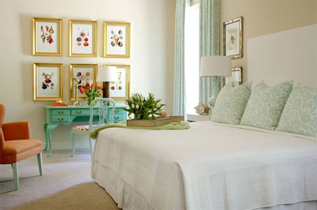
ABOVE: Soft cream walls and light flooring make this room a truly soothing getaway. A collection of colourful prints add a splash of colour above the turquoise dressing table, with curtains and pillows in a light, pale turquoise colour.
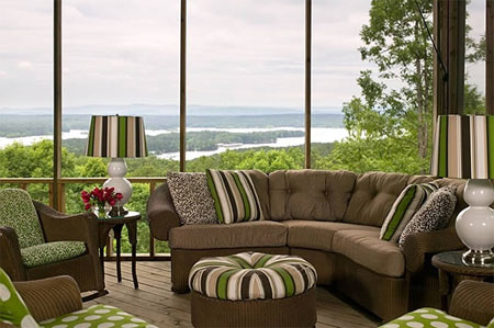
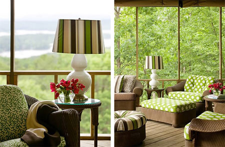
ABOVE: The intense green of the fabrics would overpower most other colours. But the rich brown of this furniture more than holds its own. Together, the two hues enhance each other, evoking the beauty of a forest.
Green is soothing and relaxing, but can overwhelm a space in its darker shades. Combine greens and rich chocolate browns for a setting that is balanced yet still fresh and vibrant. Use fabric with large prints on a white background to break up blocks of colour.
BELOW: A splash of red immediately catches the eye and breaks up the large expanse of green in the room.
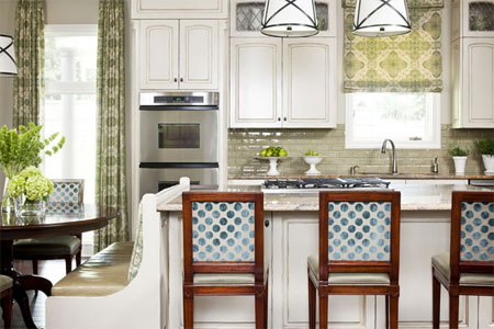
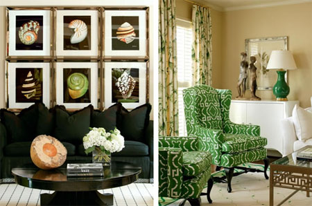
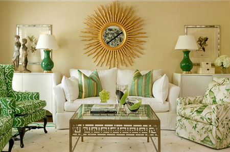
ABOVE: In both these rooms the green stands out. Bamboo curtains, wingback chairs with geometric designs and the framed prints subtly extend the room's natural inspiration.
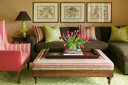
BELOW: Green can be as captivating indoors as it is in the garden. In this modern living room vibrant cushions on a chocolate sofa are used as an assertive accent. The pink wingback chair and vase of spring tulips in vivid pink offer contrasting colour that pops against the backdrop of earthy colours.
Shades of blue
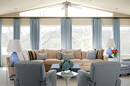
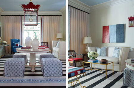
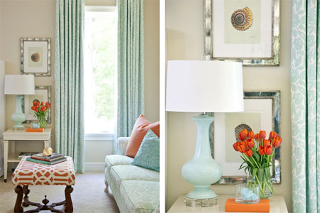
ABOVE: A two-colour palette feels fresh and fashionable when greens meet pale blues.
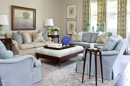
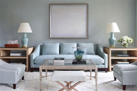
ABOVE: Among the easiest colours to add to a room, greyish blue is layered over neutral colours to create a calming effect in a living space.
ABOVE: Bathed in soft ivory and being and enlivened with a pale blue, this room becomes warm and welcoming.
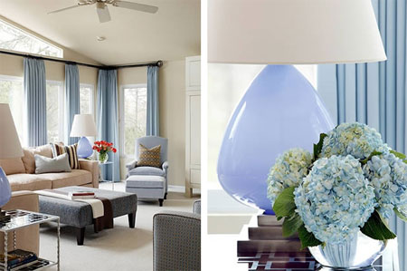
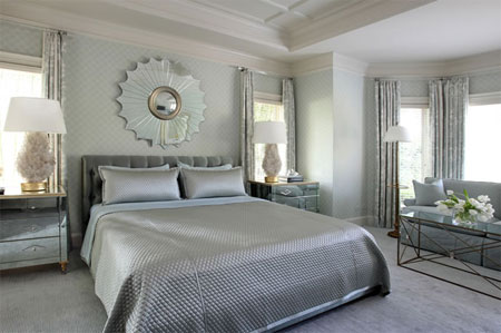
ABOVE: In this bedroom, all of the details are painted the same icy blue. A darker hue wraps around the room like a bright ribbon; the same colour emphasizes the soft fabriucs used in the drapes, upholstered ottoman and bed frill. A graphic fabric on the chairs plus paint in matt and glossy finishes keep the overall look from becoming monotonous.
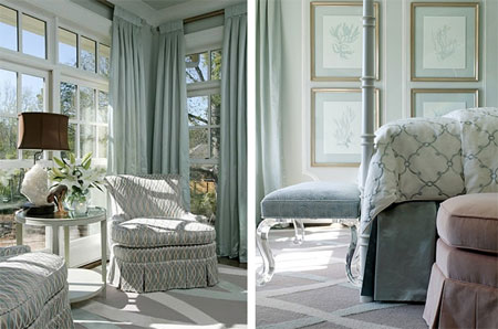
ABOVE: A love of the seaside and a range of neutrals from seashells and stones inspired the choice of restful colours for this living room.
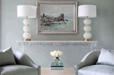
ABOVE: This soft and striking living room is anchored in neutral ice, blue shades, but the white lamps add modern pop to the space.
Shades of red
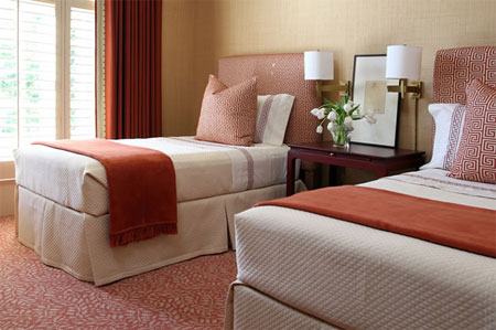
ABOVE: Embellished edges and small streaks of contrasting colour give a room weight when the palette is soft ivory or taupe.
Don't be intimidated by the robust intensity of red.
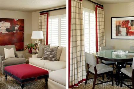
ABOVE: When decorating, use fabric and textiles to enliven a room. The upholstered ottomans provides a simple yet sophisticated design solution.
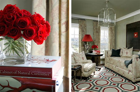
ABOVE: Afraid of colour? You can start off on a small scale by customizing a neutral room with a few coordinated accessories: a bold red shade on a tablelamp and an arrangement of fresh flowers in a vivid red.
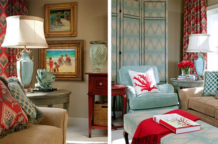
ABOVE: Bring just a touch of unexpected colour into the home: White cushions with red coral design, red textiles and fabrics - all easy and affordable ways to introduce contrasting colour in small doses.
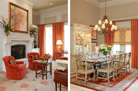
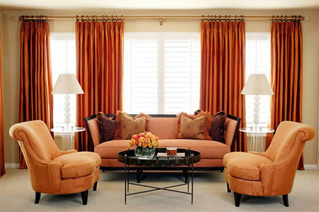
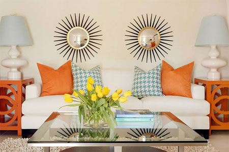
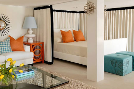
Shades of orange
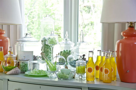
ABOVE and BELOW: Truly warm and welcoming, orange can add a myriad of effects to any room. A vibrant, citrus hue can enliven a room, while a deeper shade of pumpkin can add a lovely warmth.
ABOVE and BELOW: By selecting colour combinations that not only make you smile but also enhance the mood and setting of the rest of your house, you can design a room that is tranquil yet still has plenty of panache. In this single-room batchelor pad, cream, orange and aqua create a welcoming space that is trendy and full of fun.

ABOVE: Earthy orange - the colours of a warm sunset - look wonderful in the bedroom, where burnt oranges and creamy taupe make this room warm and enveloping.
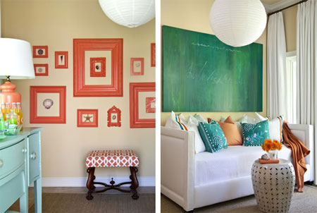
ABOVE: Hovering more towards red than a true orange, and towards green rather than blue, these rooms combine both colours to visually organize disparate elements. Picture frames, a stool and table lamp all wear the same vivid hue. Cushions, throw and a floral arrangement adds accents in a similarly intense shade.
ABOVE: Muted fabrics and finishes are the perfect canvas for highlighting colour. In this living room, splashes of orange create a modern feel against a canvas of pale aqua and cream.


0 comments:
Post a Comment